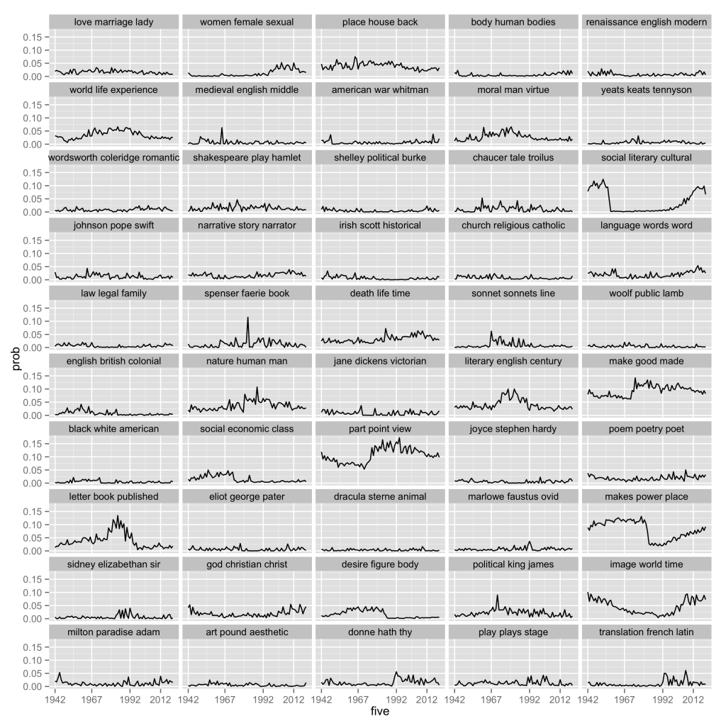
Same Stuff, Different Graph
When I started experimenting with
graphing changes in topic-proportions over time, I didn’t pay much
attention to the design of the graph. I could see that it was far too
busy, but I assumed that this would be relatively easy to adjust using
ggplot2’s many parameters.
It wasn’t. It didn’t take me too long to figure out that I needed to
change the data from discrete to continuous in order to see anything
like a sparkline, but it was also apparent from the other data sets I
was working with that taking the mean at intervals was the only way to
make a reasonably clean graph. I ended up using the aggregate function
to create the n-year averages, though I read some intriguing
descriptions of the power of data.tables in R. (I refuse to ask for help
on stackoverflow, even though it would have saved many hours worth of
work. Character flaw.)
I now need to learn how to use the reshape package, with its wonderfully named ‘melt’ and ‘cast’ features, to rewrite the code I’m using to change rows to columns. A simple for-loop iteration over a data-frame in R can take hours, I’ve learned; and I expect that this other solution would finish the job in seconds.
Anyway, here’s the revised graph of ELH with annual means of
topic-proportions: 
The full list of topics can be found in my previous post.