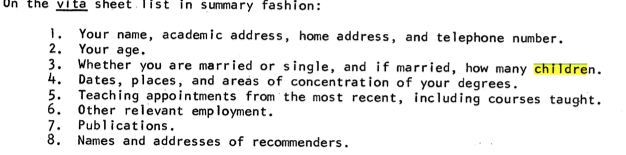
Some Notes on the MLA Job Information List
I don’t remember exactly when the MLA digitized all of the issues of the Job Information List, but I was excited about what these documents could tell us about institutional history, the job market, salary trends, and many other things. The PDFs hosted by MLA are image scans, however, which are not immediately searchable as plain text. A variety of OCR solutions are available, but I personally was too lazy to attempt to use any of them.
Jim Ridolfo, not suffering from this
despicable sloth, used OCRkit to create
searchable versions of the JIL. He then generously made them
available. There are
several ways that you can work with these documents after you’ve
extracted them from the tar archive: you can search them with your
machine’s built-in indexer (I’ve only tried this with the Mac OS),
convert them with pdftotext or similar to text documents
and then use regular command-line utilities (or not convert them and use
grep with the appropriate flags to handle binary files—I found this too
annoying to deal with personally). Converting each PDF to text with
pdftotext requires the use of find,
xargs, or a simple shell script, as globbing of the form
pdftotext \*.pdf will not work.
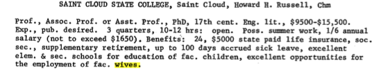
I first, following Ridolfo’s example, looked for the first example of various things. The first mention of “post-colonial” was in an ad from Williams in 1983, “science fiction” in Clemson’s ad from 1974, for example. I discovered some brazen evidence of the gender dynamics of the profession from the mid-late 60s:
And another disturbing thing from that ad is the apparent evidence that salaries have not kept pace with inflation. The Bureau of Labor Statistics’ inflation calculator reveals \$15.5K to be more than \$98K today, for example, which I suspect is not an Asst./Assoc. salary at the same institution today.
[UPDATE: Jack Lynch on facebook (one of the few facebook comments I was able to see, so I apologize if someone else pointed this out as well), noted that the St. Cloud State ad actually mentions this as a range for Full Professor, which is a reasonable figure adjusted for inflation.]
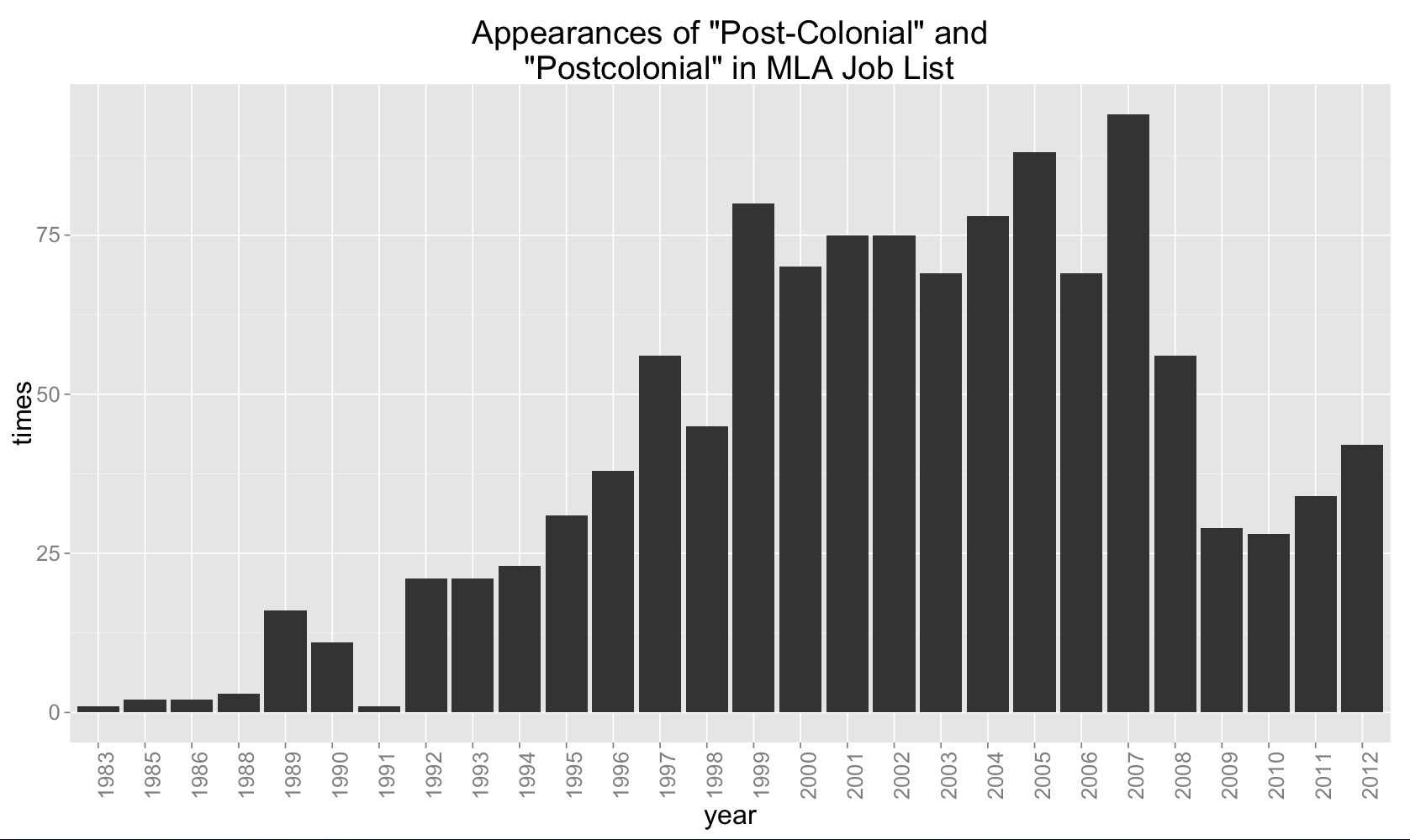
Using a bit more automation, I used grep, sed,
and uniq to create a csv of the frequency of search terms
for each year, which I then imported into R and plotted. Here, for
example, is a graph of the occurrences of the phrase “literary theory”
[UPDATE: The figures are not normalized for the number of jobs (or words in the job ads), so keep that in mind. 2007 had many more ads than 2008, for example. Again, I saw that Jack Lynch pointed this out on facebook.]

Even though this is a rough count because of OCR imperfections, overattention to verbose ads, and only counting the phrase itself, not jobs specifically asking for it alone, I still think this a useful measure of the institutionalization of the concept. I also charted “Shakespeare”

[UPDATE: Here is a graph to compare with the one above on "Shakespeare" that is normalized for the percentage of total words in all of the ads for that year. This is not the ideal way of counting its relative frequency. It's quite possible that the OCR does a better job with the more modern typesetting, and I haven't investigated this thoroughly.]

“Medieval”

“Post-Colonial” and “Postcolonial”
“Feminist”
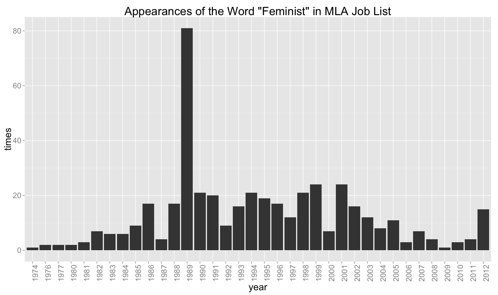
These graphs are just a simple and preliminary indication of what can be done with this data. With more attention, a queryable database that could create custom graphs of changes in sub-fields over time could be made. Slurping all of the salary ranges out of these ads and charting their growth (or lack thereof) relative to inflation could give us some more insight into the economic realities of the job market.